relevent/ marketing ideas
Put yourself in your attendees’ shoes, and plan your content with the “WIIFM – What’s In It For Me” mindset. Be sure to go beyond the bells and whistles of event features (number of speakers, exhibitors, number of sessions, etc.) and describe the results and outcomes that can be expected by attending your event.
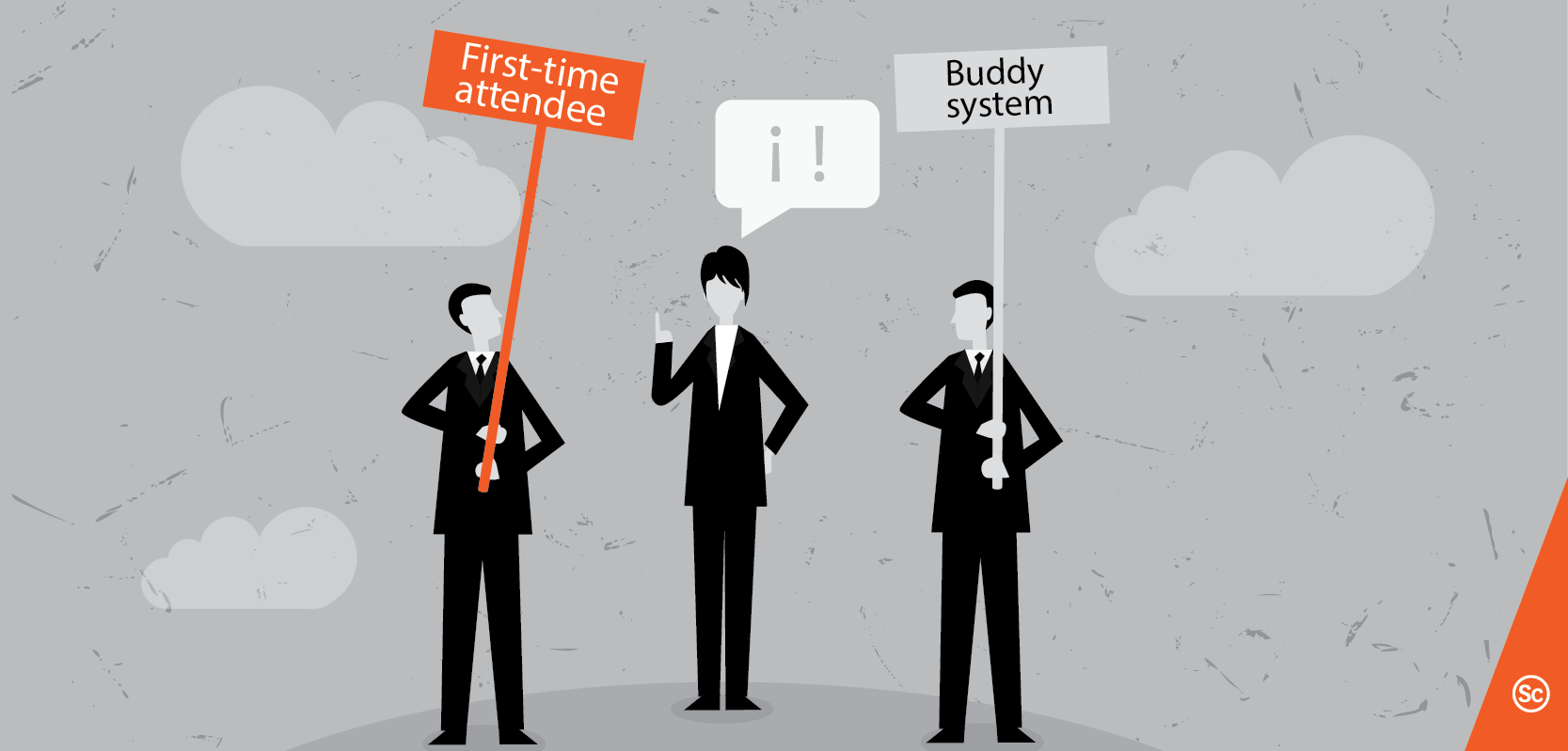
Keith Johnston, conference planning and event tech specialist, notes: “One thing that event websites forget to do is answer attendees questions. Don’t hide the price, the dates, or anything else for that matter. A simple FAQ page goes a long way.”
Also, provide an easy way for prospective attendees to contact a real person should they be close to closing the deal but are missing some information. Make sure that a phone number, email address, and social media handles are clearly visible and accessible. Want to take it a step further? Enable a chatbot on your site to assist any potential attendees in real time, via automated responses, on their journey from discovery to conversion.
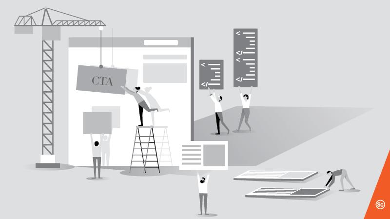
The one button on your site that has the highest impact on your bottom line is the “Register Now” button. It is what’s known as a call-to-action button, and it requires special attention.
“Place a call to action on every page because anything could convert, and you don’t want a complicated journey to get them there.” – Nick Borelli.
“Let potential attendees know what you want them to do. A giant register now button may look silly but it certainly can do the trick.” – Keith Johnston
Some key things to remember for effective calls-to-action include using a bright colour to make it stand out and giving it prominent placement. Your actual registration page is crucial as well and should be properly optimized to maximize conversions. Use straightforward headlines, and make sure the content has a narrow, purposeful focus on registration that provides a sense of urgency.
Event websites should not be static. One easy way to ensure that there’s always something dynamic on your site is to include content like:
“Conversion won’t come if people don’t know why they should go! Share content in multiple formats – videos, photo galleries, presentations, lists of products and exhibitors, etc. Make sure all your content gives compelling and authentic answers to the question, ‘Why attend?'” – Melissa Ooi, ASP.com
The current trend in web design is also a timeless one: going with a simple, clean look that still pays homage to your brand is the obvious way to cut through the clutter. Forget elements like clunky navigation toolbars and extra text, and trade them for punchier features like the hero shot, testimonials, and your unique selling proposition. Emphasize mobile responsiveness: Google announced in 2017 that it will penalize non-mobile-friendly websites in its search rankings.
“If I get to your website and it looks like %&% on my device,” says Keith Johnston, “I am looking for a new event to attend!”
Also, make sure that it’s “touch friendly” – people are just as likely to be using their fingers to click around these days as they are a mouse! Get inspired by these stellar venue website examples.
An analytics dashboard can give you actionable insights about the way your event website is being used. Tools like Google Analytics and Hotjar can measure everything from the geographic location of your visitors to the actions they take before clicking the all-important register button. With this data, you can tailor your content to your audience with much less guesswork, and easily spot the pages in your site that tend to lose peoples’ interest (pages with a high “bounce rate”). If your budget doesn’t allow for such tools, there are other ways to gain an informed perspective. Create a simple focus group and watch people interact with your site, or conduct surveys that ask people about what specific info they’re expecting to find on your website. The more you can personalize the experience of your web visitors with the help of analytics, the better!
Get in touch if you want to get a better sensov/ how your event website can increase registration with a FREE event website audit.
Justin is passionate about bridging the gap between art and business, and is constantly on the lookout for great event marketing content to share with the sensov/ community.